用法如下:
Scaffold(
    bottomNavigationBar: BottomAppBar(
      child: Row(
        mainAxisAlignment: MainAxisAlignment.spaceAround,
        children: <Widget>[
          IconButton(
            icon: Icon(Icons.home),
          ),
          IconButton(
            icon: Icon(Icons.people),
          )
        ],
      ),
    ),
    floatingActionButton: FloatingActionButton(),
    floatingActionButtonLocation: FloatingActionButtonLocation.centerDocked,
)
效果如下: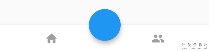
FloatingActionButton是悬浮在BottomAppBar上面,并没有嵌入里面,嵌入里面用法如下:
BottomAppBar(
    shape: CircularNotchedRectangle(),
    ...
)
增加BottomAppBar的形状,效果如下: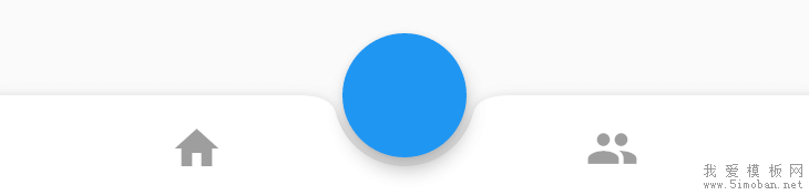
elevation参数为阴影值:
BottomAppBar(
    elevation: 8.0,
    ...
)
notchMargin参数表示缺口外边距:
BottomAppBar(
    notchMargin: 10,
    ...
)
效果如下: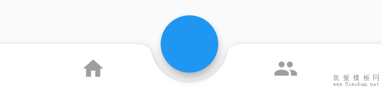
改变FloatingActionButton的形状为足球场形状,切嵌入的形状随之变化,代码如下:
Scaffold(
    bottomNavigationBar: BottomAppBar(
      shape: AutomaticNotchedShape(
          RoundedRectangleBorder(), StadiumBorder(side: BorderSide())),
      child: Row(
        mainAxisAlignment: MainAxisAlignment.spaceAround,
        children: <Widget>[
          IconButton(
            icon: Icon(Icons.home),
          ),
          IconButton(
            icon: Icon(Icons.people),
          )
        ],
      ),
    ),
    floatingActionButton: FloatingActionButton.extended(
      onPressed: () {},
      icon: new Icon(Icons.add),
      label: const Text("label"),
    ),
    floatingActionButtonLocation: FloatingActionButtonLocation.centerDocked,
)
效果如下: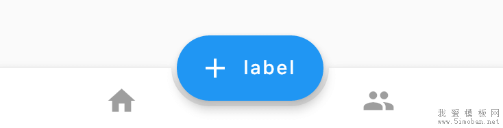
改为多边形:
Scaffold(
    bottomNavigationBar: BottomAppBar(
      shape: AutomaticNotchedShape(
          RoundedRectangleBorder(), BeveledRectangleBorder(borderRadius: BorderRadius.circular(10))),
      child: Row(
        mainAxisAlignment: MainAxisAlignment.spaceAround,
        children: <Widget>[
          IconButton(
            icon: Icon(Icons.home),
          ),
          IconButton(
            icon: Icon(Icons.people),
          )
        ],
      ),
    ),
    floatingActionButton: FloatingActionButton.extended(
      onPressed: () {},
      shape: BeveledRectangleBorder(borderRadius: BorderRadius.circular(10)),
      icon: new Icon(Icons.add),
      label: const Text("label"),
    ),
    floatingActionButtonLocation: FloatingActionButtonLocation.centerDocked,
)
效果如下: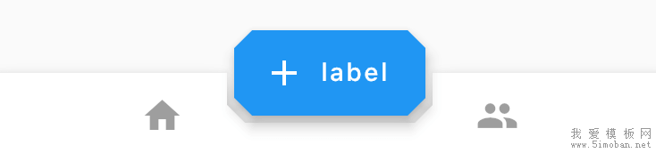
当然也可以改为棱形:
Scaffold(
    bottomNavigationBar: BottomAppBar(
      shape: AutomaticNotchedShape(
          RoundedRectangleBorder(), BeveledRectangleBorder(borderRadius: BorderRadius.circular(100))),
      ...
    floatingActionButton: FloatingActionButton.extended(
      onPressed: () {},
      shape: BeveledRectangleBorder(borderRadius: BorderRadius.circular(100)),
      icon: new Icon(Icons.add),
      label: const Text("label"),
    ),
    ...
)
效果如下: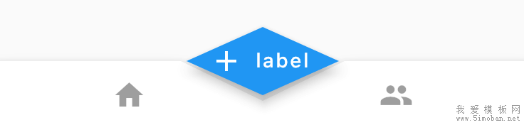
我们可以通过此控件定义任何我们想要的效果。
更多参考:
BottomNavigationBar底部导航栏详解、
BottomAppBar底部应用栏和floatingActionButton实现中间凸起的底部导航